


Sporting Clube de Portugal (SCP) was founded in 1906 on a Code that reaches beyond sport. Today, on its 120th anniversary, Sporting CP is unveiling a new brand identity, its first in 25 years, alongside an evolved crest, developed with global branding agency JKR.
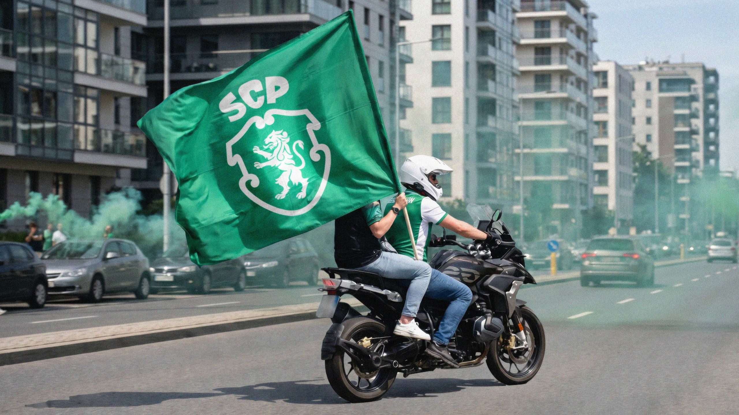
“The Code has always rested on one principle: develop the human, then the athlete. Our new identity flows from that belief. We needed people to feel this through the brand itself. Creating an experience that could expand beyond the category, attracting those who connect to what we stand for,” said André Bernardo, Chief Strategy and Operations Officer, Sporting Clube de Portugal.
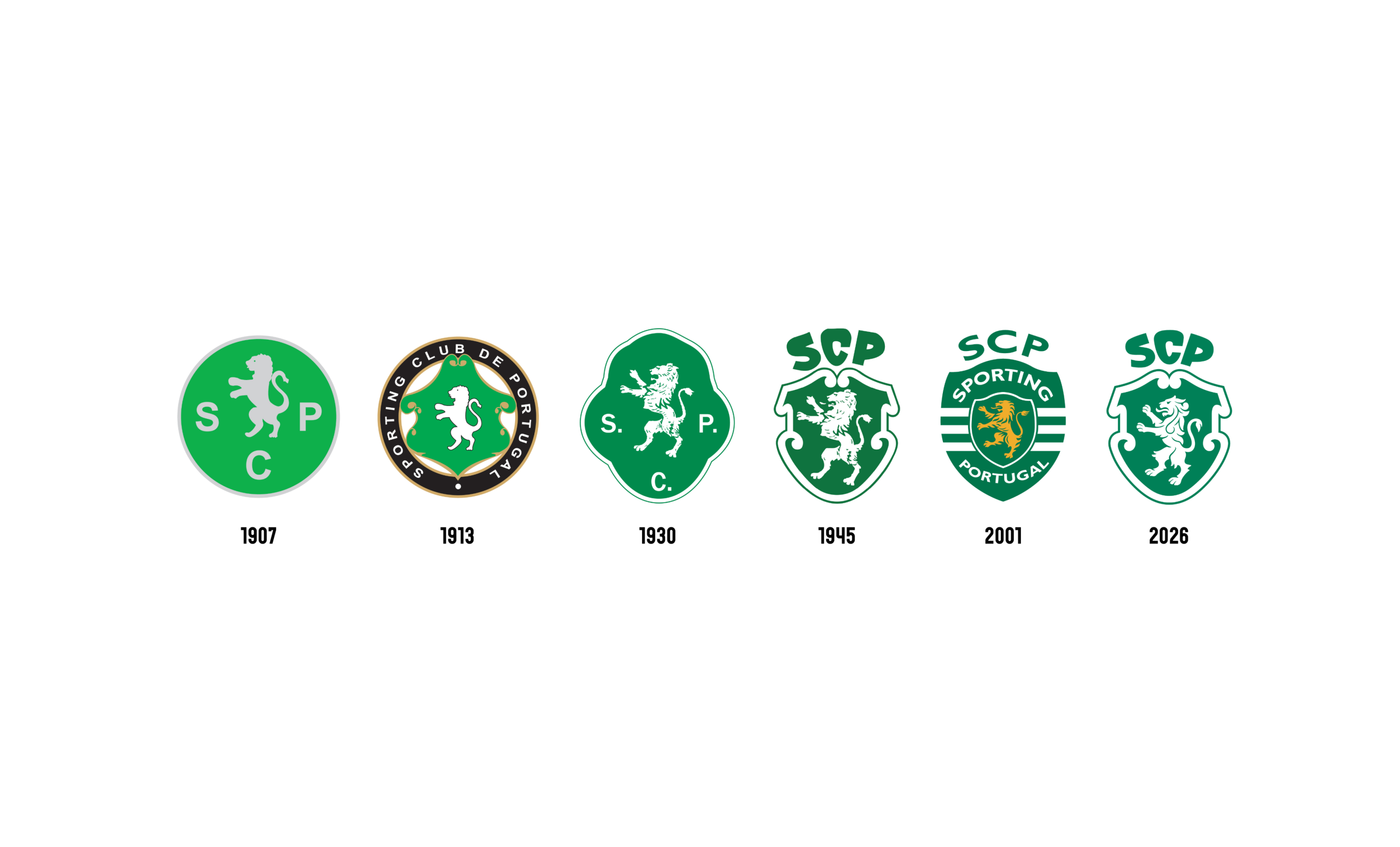
For the first time five symbols that have always defined the club – Porta 10-A, the Stripes, the Shield, the Crown, and the Lion – speak as one expression of the club’s Code. Every element of the new brand identity culminates in the club’s new crest, a recrafted symbol inspired by the 1945 version, a fan favourite famed for its distinctiveness.
The Porta 10-A
The gate through which players enter the pitch at Estádio José Alvalade has always represented more than physical access. It is the journey to reaching one’s potential, the threshold to becoming. The craftsmanship of that door inspired the pattern now woven through the entire identity system.
The Stripes
The green and white stripes are earned, not given. The club believes greatness is achieved through actions. The stripes inspired the motion design of the identity, representing the ongoing journey.
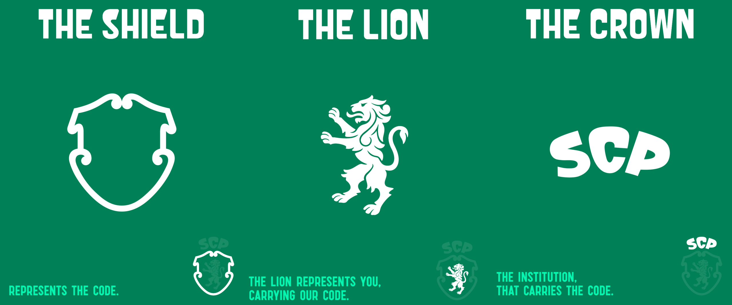
The Shield
Sporting’s shield takes inspiration from the 1945 crest, with a distinctive silhouette that fans loved and that reflected Portuguese visual language. Across the brand, it becomes a flexible design device, used to frame the people who embody the club’s resilient spirit in both graphic applications and the real world.
The Crown
The SCP acronym forms a crown above the shield, representing the institution. The crown sits atop those who live by the Code and carry it from generation to generation. The crown inspired a new typeface: Sporting Sans.
The Lion
The lion represents the club’s fans, drawn from all lions from the previous five crests. The flourishes in the shield that represent the code, were crafted to the lion’s mane where they act as a reminder that the individual is the one that carries the code.
“It was not a case of starting from scratch, but drawing from everything the club has already lived. Our job was to build a brand system that carries the spirit of Sporting CP forward without limits. A visual language as distinctive and ambitious as the club itself,” said Sean Thomas, Global Executive Creative Director at JKR.
The crest and brand system debuts as part of the club’s 120th anniversary. For more information, visit www.sporting.pt/en.
Enjoyed this article? Join over 2,900 sport professionals who receive our weekly newsletter here.


